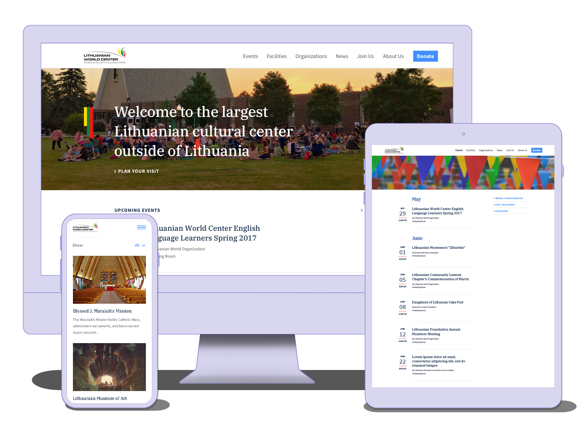
In 2016 Devbridge Group donated design and engineering time to a website for a nonprofit community organization. Built on an old WordPress template, the site looked outdated, which made it hard to focus on the content.
We met with the community center leaders and the web administrator to define their needs and the needs of the community. Workshops like these are crucial when working with multi-department organizations. They are a way of ensuring everyone is heard and buys into the same message and project goals.
We divided the users into needs-based segments. These included people looking for information about an event, those interested in renting a space, and users trying to find an organization within the community center. Our primary goal was to provide easy access to the information being sought. Our secondary goal was to collect donations and engage volunteers.
Because the home page is not always the entry point to a site--users can enter through inbound links from search engines, direct links that people share, and links from third-party affiliates--I restructured the navigation to include all of the necessary trigger words to accommodate the way each user arrived.
What I didn't mention above is that the overarching objective of any community center is to grow its community by bringing people together and encouraging them to become active and engaged. In addition to providing clear paths to information, we also wanted to provide visitors with information about current happenings and opportunities for participation. So, we added a news page.
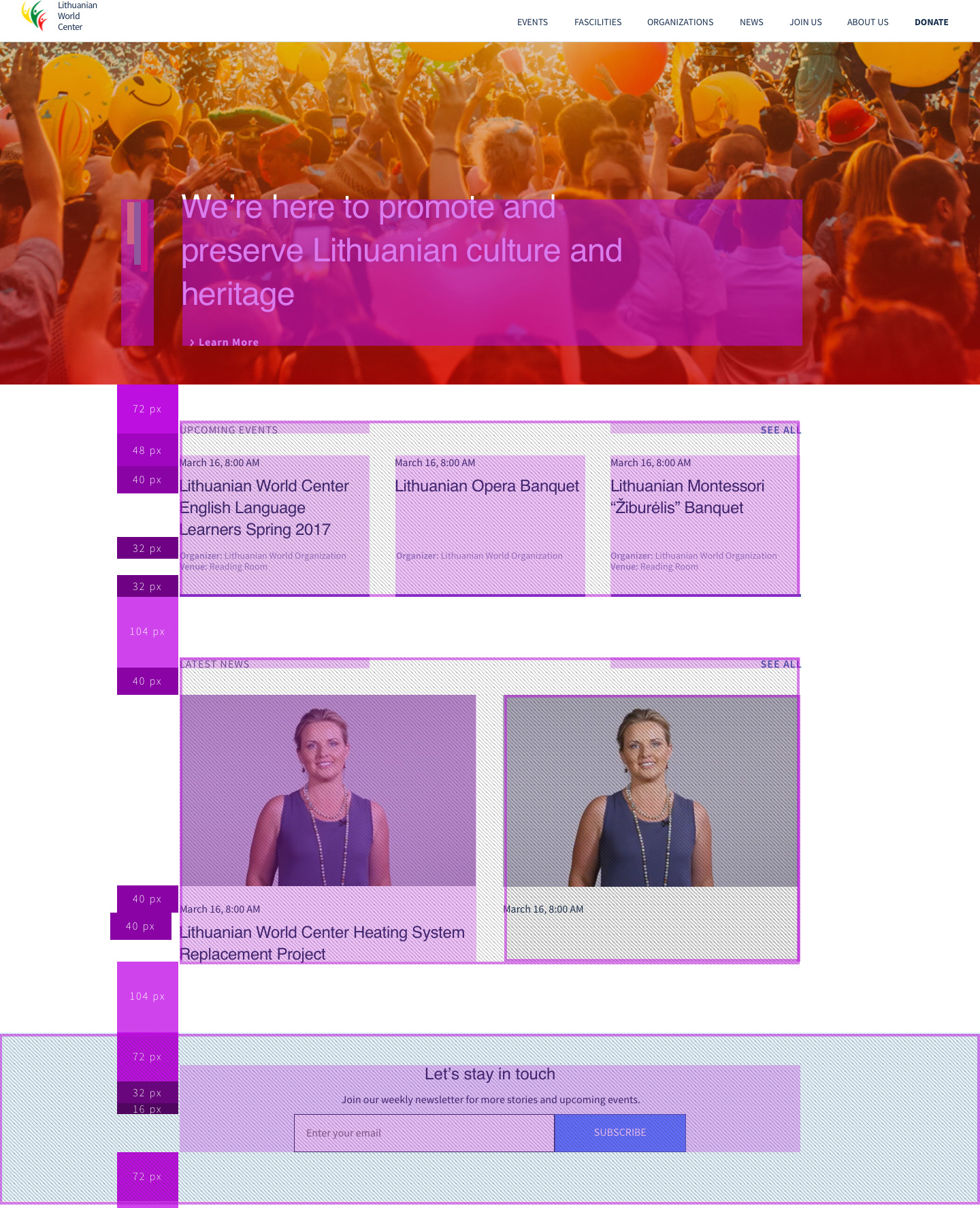
I favor the saying, "The best design is the one you don't notice." To eliminate any constraints for the content generators, I focused on creating a visual hierarchy with typography. This ensured that the design would work with all types of imagery.
.jpg)

So the design elements would work with a variety of images, whether they were black and white, full color, sepia tone, or created with an Instagram filter, a few shades of neutral navy blue were chosen. I also included a shade of red to use as a subtle callout.

The client had no significant design constraints, beyond a need for multilingual fonts. Since I know this site will be content-driven, I also created a hierarchy for typography styles.

I reviewed popular publishing websites and other community websites for inspiration, and because many users pick up scrolling habits through frequent use of familiar sites. Incorporating some of the latest trends, when they add to the experience, can make a site more user-friendly.